
Back in Oct of 2014 we did a post about responsive web design for Google AdSense. The post was really popular but as all things internet related do, the details and process have evolved quite a bit since Oct 2014.
With that in mind I thought I’d publish a quick update as sort of a “heads up” to bloggers & publishers who may still be struggling with this issue. It’s actually very very simple now for Google AdSense. We will cover setting it up in DFP and other ad servers in a later post but we’ll keep this post nice and simple for Google AdSense.
It took me a while to grasp this but Google’s new “Responsive” format will fit ANY ad size – including the 728×90. I mistakenly thought the responsive ad size was simply a 300×250 that would scoot over on a mobile device screen…
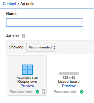
I always opted for the 728×90 as my header ad, but in fact the responsive unit IS a fully responsive ad unit that when placed within a “div” tag will read the size of the space and serve ad formats that fit based on the user’s screen size. It’s pretty awesome. As an example, below are some shots of how the Apex blog looks on my desktop (Macbook Pro) and on my iphone.
Here’s the types of ads I’ll see on the desktop version of the site:

And here’s how that ad unit displays on the mobile version of the site: